
Goals:
Our review zeroes in on:
Dissecting the user's navigational experiences during Klarna's onboarding process.
Identifying design brilliance and areas needing a touch-up for a frictionless experience.
Unearthing the triumphs and tribulations of first-time users.
Drawing parallels with analogous financial platforms to spotlight best practices and set new benchmarks.


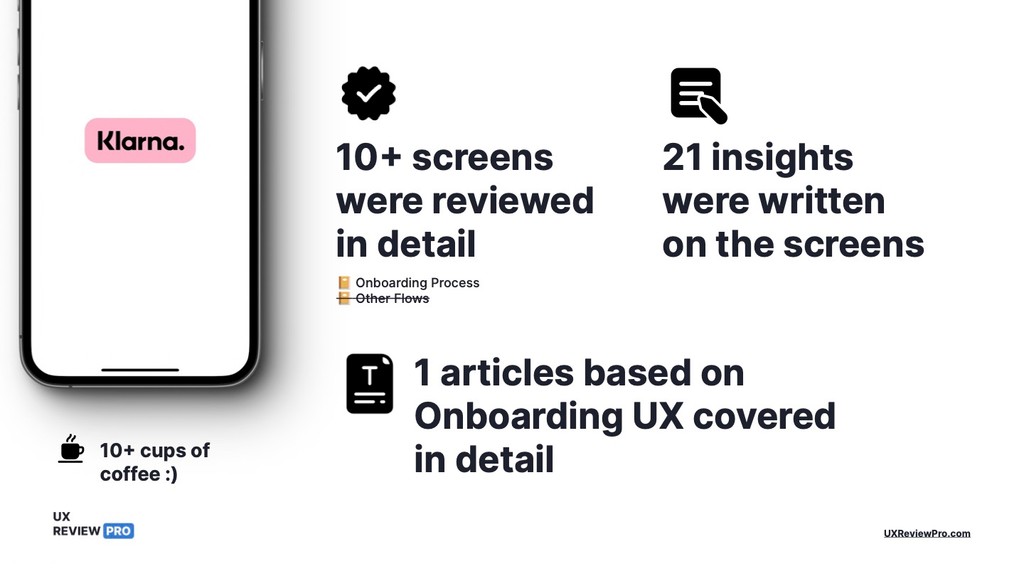
10+ screens were reviewed in detail
📔 Onboarding Process
📔 Other Flows


1 article based on Onboarding UX covered in detail

10+ cups of coffee :)
Market Trendsetter: Klarna is recognized as a leader in the buy now, pay later space, setting trends that others follow.
Why Klarna?
By exploring Klarna's user journey, we can uncover the nuances that make its service appealing to users and identify the unique challenges it overcomes to provide a seamless experience. Furthermore, Klarna's approach to integrating e-commerce with flexible financing options represents a significant shift in consumer behavior and expectations. This makes Klarna an essential case study for understanding current trends in fintech and e-commerce convergence.
In our report, we will dissect Klarna's onboarding flow meticulously, pinpointing the elements that contribute to its success and those that could be enhanced. Our aim is to draw actionable insights that can aid application developers, UX/UI designers, and product strategists in the fintech sector. By learning from Klarna's strategies, we hope to contribute to the ongoing evolution of user experience in financial technology applications.
Index
UX Reviewed
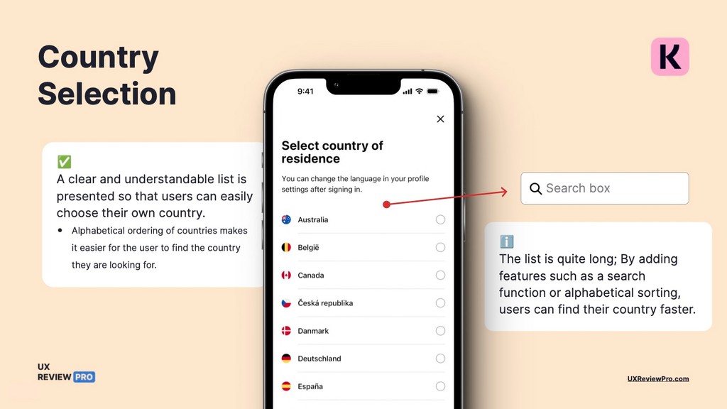
📔 Country Selection
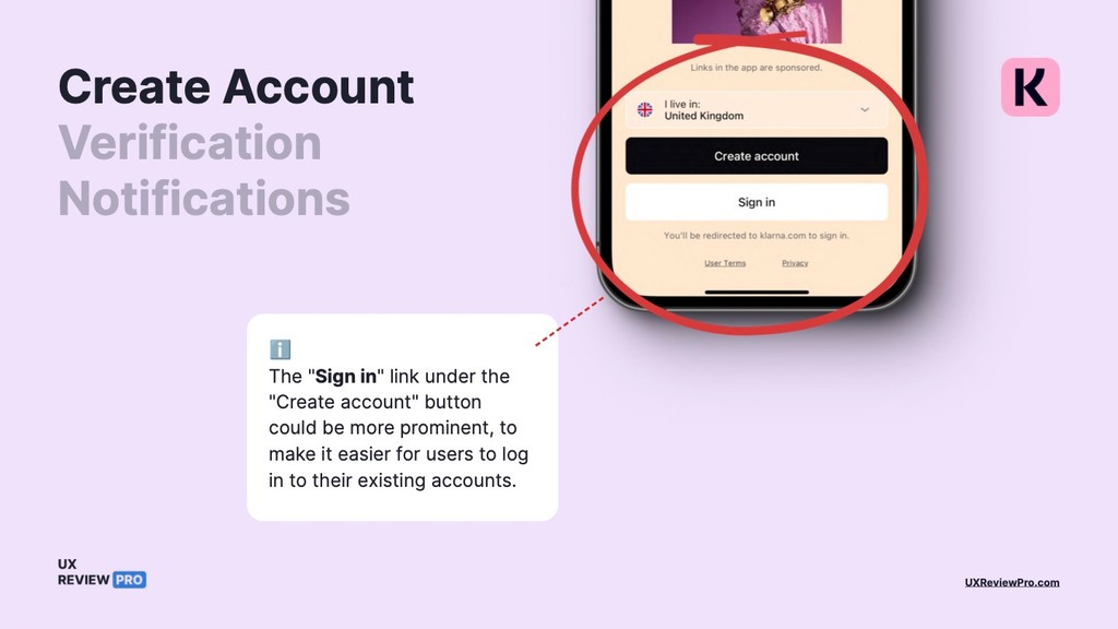
📔 Create Account
📔 Verification
📔 Notifications
📔 Home Page
Articles
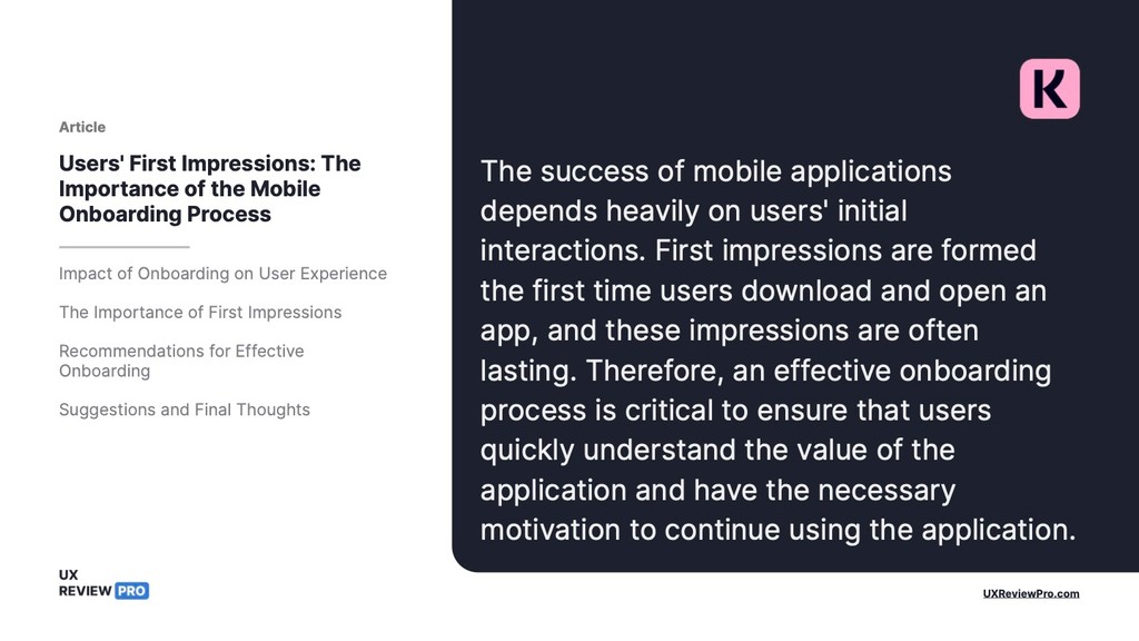
🖹 The Importance of the Mobile Onboarding Process
Download the PDF Only